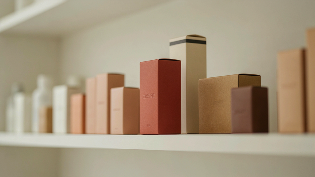
Walk down any grocery, beauty, or home goods aisle and you’ll notice something quickly. Your eyes don’t land on everything equally. A few products pull you in while dozens of others blur together.
That pull is rarely an accident. Packaging that stands out on shelves usually combines a few deliberate choices: color, type, shape, materials, and a clear sense of who the brand is.
This guide breaks down what those choices look like in practice, with examples from food, cosmetics, beverages, and more.
Understanding the Psychology of Retail Shelf Appeal
Shoppers make fast decisions. In most stores, a product has a few seconds to be noticed, understood, and considered. Shelf appeal packaging works because it makes each of those steps easy.
Packaging also shapes perception. A clean, well-finished box suggests care. A cluttered, inconsistent one can make even a good product feel less trustworthy.
Think of a small-batch hot sauce next to a mass-market brand. If the small brand’s label is confident and easy to read, it signals quality before anyone tastes a drop.
The Role of Colors in Packaging Design
Color is usually the first thing a shopper sees. It sets mood, signals category, and helps a product separate itself from its neighbors.
Use Color to Contrast, Not Just Decorate
Look at what surrounds your product. If every competing tea box is green and cream, a deep navy or warm terracotta may get noticed faster.
Contrast also matters within the design. Dark text on a light background, or the reverse, keeps names and key details legible from a few feet away.
Respect Category Expectations
Shoppers rely on color cues. Skincare often leans soft and clean, while energy drinks tend toward bold, high-contrast palettes. Breaking those habits can work, but do it on purpose.
A natural soap brand might use earthy tones to signal simplicity. A jewelry brand might choose a restrained palette so the piece itself becomes the focal point.
How Typography and Graphics Influence Product Visibility
Type does two jobs. It carries information, and it expresses personality. A playful hand-drawn script fits a bakery. A sharp sans-serif suits a tech accessory.
Prioritize Readability First
A beautiful font that’s hard to read from three feet away is a liability. The product name should be the clearest element on the front of the package.
Limit yourself to two or three typefaces. More than that tends to look chaotic, especially on small packages.
Let Graphics Support the Message
Illustrations, patterns, and icons can communicate flavor, scent, or use at a glance. A citrus illustration on a sparkling water can, or a simple leaf mark on a face serum, tells shoppers something instantly.
Simple graphics often hold up better than busy ones. Whitespace gives the eye a place to rest and makes the important parts stand out.
Why Unique Packaging Shapes Make a Difference
Shape is one of the quickest ways to break from a sea of rectangles. A tapered bottle, a tall slim carton, or a box with a window can catch attention even before the graphics register.
Beverage brands often do this well. A distinctive bottle silhouette can be recognizable even without a label.
That said, unusual shapes come with trade-offs. They can cost more to produce, take up awkward shelf space, or complicate shipping. For many small brands, a standard shape with a smart detail works better.
Small touches count too. A custom insert, a die-cut window, or a distinctive closure can add personality without redesigning the entire package.
The Importance of Consistent Brand Identity
A single great package helps. A consistent family of packages helps far more. When shoppers see the same colors, type, and layout across your products, they start to recognize you from a distance.
Consistency also builds trust. A candle brand with matching labels across scents feels established, even if it’s only a few months old.
This doesn’t mean every product must look identical. A shared structure with small variations, like a different accent color per flavor, keeps the line cohesive and still easy to navigate.
Businesses looking to create a consistent visual identity can explore different custom packaging solutions that match their products and brand personality.
How Custom Printing Helps Products Stand Out
Printing is where design decisions become physical. The right choices can make a box feel premium, playful, or practical.
Using custom printed boxes gives brands an opportunity to display their logos, brand colors, and product messaging through packaging.
Finishes and Techniques Worth Considering
Different finishes create different impressions:
- Matte coatings feel modern and understated, which suits cosmetics and personal care.
- Gloss coatings make colors pop, which can help snacks and beverages.
- Spot UV or foil accents highlight a logo or detail without covering the whole surface.
- Embossing adds texture that shoppers notice when they pick the box up.
Not every product needs every technique. One well-chosen accent, such as a foil logo on an otherwise simple box, often does more than several effects competing for attention.
Balancing Attractive Design With Practical Packaging
Packaging has to do more than look good. It has to protect the product, survive shipping, and make sense to the person opening it.
A fragile item like a ceramic candle or glass perfume bottle needs structure and cushioning first. Design works around that, not the other way around.
Functionality shapes the customer experience too. Boxes that are easy to open, close, and store feel thoughtful. Packaging that tears, crushes, or frustrates people undoes the good impression the design created.
Materials matter as well. Kraft paper suggests natural or handmade goods, while smooth rigid boxes suit jewelry and gifts. Match the material to what the product promises.
Common Packaging Design Mistakes to Avoid
Even good products can get lost behind weak packaging. These are the problems that come up most often:
- Too much information on the front. When everything competes, nothing wins. Keep the front focused on the name, a key benefit, and one strong visual.
- Poor label readability. Tiny text, low contrast, or glossy glare can make ingredients, directions, or sizes hard to find.
- Ignoring the shelf environment. A design that looks great on a screen may disappear under store lighting or beside brighter competitors.
- Inconsistent branding. Changing fonts, colors, or layouts between products makes a brand harder to recognize.
- Overcomplicating production. Too many finishes or custom components can raise costs without improving the result.
Practical Tips for Creating Shelf-Ready Packaging
Small businesses don’t need a huge budget to improve packaging. A few focused steps can make a real difference.
Study your shelf neighbors. Visit stores or browse competitor listings and note what dominates. Then decide where you can differ.
Pick one hero element. Choose a color, shape, or graphic to carry the design. Everything else should support it.
Test from a distance. Place a mockup across the room. If you can’t read the product name or recognize the category, simplify.
Prioritize key information. Make sure the product name, type, and size are easy to find. Details like ingredients and instructions can sit in a secondary position.
Build a simple system. Define your colors, fonts, and layout rules once, then apply them across every product.
Gather real feedback. Show prototypes to a few customers or retail buyers. Ask what they notice first and what they think the product is.
Sample before you commit. Printed samples reveal how colors, finishes, and materials actually look and feel, which screens can’t fully show.
Conclusion: Making Your Product Easier to Notice and Remember
Standing out on a crowded shelf rarely depends on one big idea. It comes from many small decisions working together: a distinctive color, readable type, a considered shape, and a consistent identity.
The strongest packaging also respects practical limits. It protects the product, fits the budget, and tells shoppers what they need to know.
Start with one change, whether that’s clearer typography, a bolder color, or a tighter layout. Then build from there. Over time, those choices make your product easier to notice and easier to remember.