A sign is often the first visual feature people notice when they approach a shop, office, hotel, or commercial building. Its appearance can influence how easily they recognise a business and understand its location. Unlike flat printed boards, 3D signage uses raised letters, shapes, and logos to create depth and a more noticeable display. This makes it useful for businesses that want clear identification without relying entirely on large graphics or complicated designs.
Three-dimensional signs are used in many settings, including reception areas, shopfronts, building entrances, exhibition stands, and corporate offices. Their appearance can range from simple raised lettering to illuminated logos made from different materials. The right design depends on the location, viewing distance, surrounding architecture, and purpose of the sign.
1. Why 3D Signage Is Used in Modern Business Environments
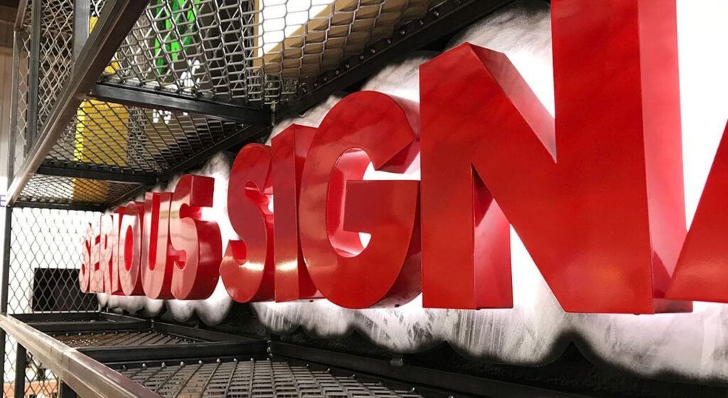
Businesses need signs that communicate information clearly while fitting the appearance of their premises. Raised lettering adds a physical dimension to a display, allowing letters and logos to stand away from the wall rather than appearing as a flat image.
For example, a company reception area may have a plain wall behind the front desk. Adding raised letters with a suitable finish can make the business name easier to identify and give the space a more organised appearance. A retail shop may use dimensional lettering above its entrance to make the name visible to people walking along the street.
Improving visibility through depth
Flat graphics depend mainly on colour and contrast to attract attention. Raised lettering introduces shadows and changes in appearance as the viewing angle or lighting changes. This can make the sign more noticeable without adding unnecessary text.
The amount of depth matters. Letters that are too shallow may look almost flat, while excessively thick lettering may appear out of proportion on a small wall. The design should suit the available space and the distance from which people will view it.
Creating a consistent business identity
A business may use the same logo and lettering style across its reception area, exterior entrance, meeting rooms, and other locations. Using a consistent design helps visitors recognise the organisation in different parts of the property.
For example, a company with several departments can use the same lettering style for its main reception sign and individual department signs. The wording changes, but the overall appearance remains connected.
2. Materials Commonly Used for Three-Dimensional Signs
The material affects the sign’s weight, finish, durability, production method, and installation requirements. Before selecting one, businesses should consider whether the sign will be installed indoors or outdoors and how much exposure it will receive.
Acrylic for versatile lettering
Acrylic is widely used for raised letters, logos, reception signs, and decorative wall displays. It is available in different colours and thicknesses, allowing designers to create simple or layered effects.
Acrylic letters can have a glossy, matte, transparent, or coloured appearance. They may also be combined with printed graphics or mounted on a backing panel.
For instance, a technology company might choose white acrylic letters on a dark wall. A hotel could use metallic-effect acrylic lettering to complement its interior design.
Stainless steel for a metallic appearance
Stainless steel is often selected for business names, building identification, and reception displays where a metal finish is preferred. Brushed and polished surfaces create different visual results.
The grade of steel should match the installation environment. Outdoor signs may require additional consideration of moisture, surface maintenance, and exposure to environmental conditions.
Aluminium for lightweight construction
Aluminium offers a combination of strength and relatively low weight. It can be shaped into letters, logos, and other dimensional elements. Painted or coated finishes provide additional design choices.
It is often considered for larger signs where the weight of the finished structure is an important factor. The thickness and support system should be selected according to the dimensions and installation surface.
Other materials and combinations
Some signs combine several materials to create a particular appearance. For example, acrylic lettering may be mounted on an aluminium backing panel, or metal letters may be fixed to a decorative wooden surface.
Combining materials can create visual contrast, but each material should be compatible with the others. Differences in weight, expansion, fixing methods, and maintenance requirements need to be considered during planning.
3. How Custom Signage Dubai Businesses Choose Supports Different Needs
Different businesses require different sign styles. A restaurant, medical centre, retail shop, and corporate office may all need raised lettering, but their designs and practical requirements will not be the same. This is why custom signage Dubai businesses choose should be based on the actual location and intended use rather than a standard design.
Retail shops and commercial entrances
Retail signs usually need to identify the business from a suitable distance. Letter size, contrast, lighting, and placement all influence how easily people can read the name.
A shop in a shopping centre may use raised letters on an internal fascia, while a street-facing store may require a sign that remains visible in daylight and after sunset. The surrounding signs should also be considered to avoid a crowded appearance.
Offices and reception areas
Office signs often focus on identification and presentation. Raised company names, logos, department labels, and reception lettering can help visitors recognise the correct location.
For example, a business centre with several tenants may use individual dimensional signs outside each office. Consistent placement and readable lettering help visitors find the right company.
Hotels and restaurants
Hotels may use dimensional lettering for reception walls, entrances, restaurant names, and internal directories. Restaurants can use raised logos or letters to create a recognisable display above a counter or entrance.
The design should suit the atmosphere of the space. A modern restaurant may prefer clean metal lettering, while a traditional venue may use warmer finishes and more decorative shapes.
4. Understanding Different Types of 3D Sign Designs
Three-dimensional signs can be produced in several styles. Each type creates a different visual effect and serves particular purposes.
Raised non-illuminated letters
These signs use physical depth rather than internal lighting. They are suitable for indoor reception areas, office walls, corridors, and locations with sufficient ambient light.
Their appearance depends on the material, thickness, colour, and mounting distance from the wall. A small gap behind the letters can create natural shadows that make the lettering more noticeable.
Front-lit illuminated letters
Front-lit letters contain lighting that shines through the front face. They are commonly used for exterior business signs and shopfront displays where visibility during evening hours is important.
The front material needs to allow light to pass through evenly. Poorly planned lighting can create bright spots or uneven illumination, so the position and spacing of the LED modules matter.
Halo-lit letters
Halo-lit lettering produces a glow behind the letters rather than directly through their front surfaces. The light reflects onto the wall, creating an outline around each character.
This style is often used in reception areas, hotels, and premium commercial interiors. The wall colour and surface finish affect the final result because the reflected light needs a suitable background.
Layered dimensional signs
Layered signs use multiple materials or levels to create depth. For example, a business logo may have a coloured acrylic base with raised metallic lettering on top.
This approach is useful when a design contains different shapes, symbols, or visual elements. However, the layers should remain proportionate so the sign does not look unnecessarily complicated.
5. Planning the Design Before Production
A successful sign begins with a clear design plan. The artwork should be prepared according to the installation area, viewing distance, selected material, and mounting method.
Choosing the right dimensions
The sign should be proportionate to the wall or fascia where it will be installed. A large logo may suit a wide reception wall, but the same design could overwhelm a small office entrance.
Letter height should also reflect the expected viewing distance. People standing directly in front of a reception sign can read smaller lettering than people approaching a shop from across a road.
Selecting fonts and colours
The font should be readable and consistent with the business’s visual identity. Very thin strokes or decorative characters may be difficult to produce accurately in small sizes.
Colour selection should consider both the sign and its background. A light-coloured letter on a pale wall may lack contrast, while a darker or metallic finish may improve visibility.
Preparing accurate artwork
Before production, the logo and lettering should be checked for spelling, proportions, spacing, and alignment. Vector artwork is commonly used because it can be scaled without losing the sharp edges needed for cutting.
Businesses comparing production examples from suppliers such as Zahrat Al Madina Printing can examine how different materials, letter thicknesses, and finishes affect the final appearance.
6. The Production and Installation Process
The production process varies according to the material and sign type, but most projects follow a series of stages.
Design preparation: The artwork is reviewed, dimensions are confirmed, and the selected material and finish are specified.
Material cutting: Letters and shapes are cut using suitable equipment. The cutting method depends on the material, thickness, and complexity of the design.
Finishing: Edges may be polished, surfaces coated, and individual pieces prepared for assembly. For layered signs, the different components are aligned and joined.
Lighting preparation: If the sign is illuminated, LED modules, wiring, power supplies, and access for maintenance need to be planned.
Mounting preparation: Fixing points and templates help position the letters accurately. The wall or supporting surface should be checked to ensure it can hold the finished sign safely.
Installation and inspection: Once mounted, the sign should be checked for alignment, spacing, surface quality, stability, and lighting performance where applicable.
For larger exterior installations, structural support and relevant permissions may also need to be considered before work begins.
7. Common Problems and How to Avoid Them
Even a well-designed sign can produce disappointing results if important details are overlooked.
Poor letter spacing
Letters placed too close together can become difficult to read, particularly from a distance. Spacing should be reviewed at the actual sign size rather than only on a computer screen.
Incorrect material thickness
Very thin letters may not create the intended dimensional effect, while excessively thick letters can make a design look heavy. Material thickness should match the letter size and overall style.
Uneven illumination
Illuminated signs can develop inconsistent brightness if LEDs are poorly positioned or unsuitable materials are used. A lighting layout should be reviewed before assembly.
Weak installation support
Dimensional letters need secure fixing, especially when installed outdoors or on large surfaces. The mounting method should suit the wall material and the weight of the sign.
Neglecting maintenance
Dust, surface marks, damaged lighting, and loose fittings can affect a sign’s appearance. A maintenance plan helps identify problems before they become more serious.
8. Maintaining Three-Dimensional Signs Over Time
Maintenance depends on the material, location, and construction. Indoor signs may need occasional dusting and gentle cleaning, while outdoor signs require more frequent inspection because of environmental exposure.
A soft cloth and a cleaning product suitable for the material can help prevent surface damage. Abrasive pads and harsh chemicals should be avoided when they may scratch acrylic, damage coatings, or affect polished finishes.
Illuminated signs should also be checked for uneven lighting, loose connections, and damaged components. Electrical inspection and repairs should be handled by qualified personnel.
For exterior installations, it is useful to inspect mounting points and supporting structures periodically. Heat, wind, moisture, and repeated exposure to dust can affect components over time.
Conclusion
Three-dimensional signs combine material, depth, lettering, and sometimes lighting to create clear business identification. Their uses range from simple office reception displays to illuminated shopfronts and large commercial building signs. The most suitable design depends on the installation location, viewing distance, material, and maintenance requirements. By planning the artwork carefully and considering production and installation details from the beginning, businesses can create dimensional signs that remain readable, practical, and visually consistent over time.